inspiredminds/contao-image-alternatives
最新稳定版本:1.3.1
Composer 安装命令:
composer require inspiredminds/contao-image-alternatives
包简介
Contao extension to provide the possibility of defining alternative images to be used on different output devices.
README 文档
README
Contao Image Alternatives
This extensions expands the capabilities of using responsive images with art direction in Contao. You will have the possibility to define a set of alternatives which will then allow you to define the respective alternatives per image in the file manager.
Suppose you want to use different images for a certain image size depending on the output device, i.e. a specific image for desktop, for tablets and for mobile. You can define a set of alternatives called mobile and tablet for example (desktop will be the fallback - the original image):
# config/config.yaml
contao_image_alternatives:
    alternatives:
        - tablet
        - mobile
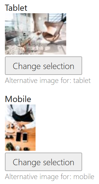
Now you can choose the alternatives for each image separately in Contao's file manager:
The back end labels for each alternative can be translated via the image_alternatives translation domain:
# translations/image_alternatives.en.yaml
tablet: Tablet
mobile: Mobile
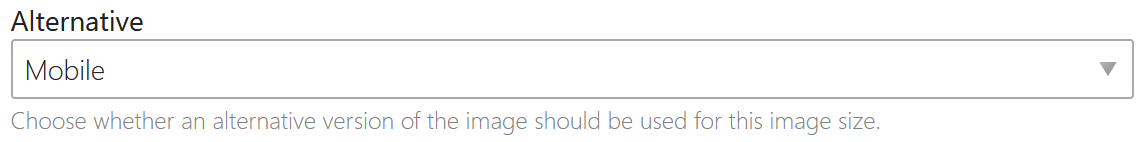
Within your image size settings you can then choose per media query item, whether an alternative image should be chosen for this particular image size:
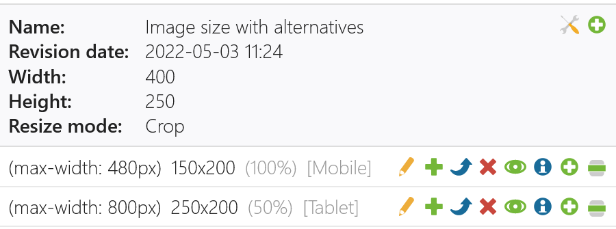
Alternatively you can also set the alternative in your config via contao_image_alternatives.sizes.*.items. Note that the name of the size must be same name as in contao.image.sizes and the media query for each item must match with the ones in contao.image.sizes.*.items:
# config/config.yaml
contao_image_alternatives:
    alternatives:
        - tablet
        - mobile
    sizes:
        example:
            items:
                -
                    media: '(max-width: 480px)'
                    alternative: mobile
                -
                    media: '(max-width: 800px)'
                    alternative: tablet
When you choose the configured image size in your content element or module, the generated images will automatically use the alternative versions for each source image for the particular image size media query item.
Alternative Important Parts
It is also possible to set different important parts for each image alternative. When editing an image in the file manager, there will be a an Important part alternative selection at the top, with which you can switch between the different important parts. For example if you have set the default important part for an image, plus the important part for the mobile alternative, then latter will be used for your mobile media query image size item (if configured) and otherwise the default. This allows you to crop the image to different parts for different output devices within the same image.
Pre-Crop
It is also possible to to pre-crop the image to the important part before the image is resized according to the resize settings. This allows you to crop the image to the important part for certain image sizes while otherwise only resizing to a specific width or height. This setting can be set per image size in the database and also via the bundle configuration:
# config/config.yaml
contao_image_alternatives:
    sizes:
        example:
            pre_crop: true
Attributions
Development funded by:
- ncm - Net Communication Management GmbH
- nickname . Büro für visuelle Kommunikation
统计信息
- 总下载量: 2.02k
- 月度下载量: 0
- 日度下载量: 0
- 收藏数: 12
- 点击次数: 3
- 依赖项目数: 0
- 推荐数: 0
其他信息
- 授权协议: LGPL-3.0-or-later
- 更新时间: 2022-05-03